
Note:
👀 OVERVIEW
What is this project about?
Grab n' Go is a locker system that simplifies the food ordering and pickup process for busy individuals. The integration of mobile app and locker with kiosk provides flexible food options, clear order tracking, and easy navigation, ensuring a fast, safe and seamless experience.
❓ CHALLENGE
Dissonance between the desired respite and the reality cause dissatisfaction
Mealtime often serves as a brief respite in our hectic days. Yet, long wait times and cumbersome process make it a hassle. This made me wonder how might we empower busy individuals to reclaim mealtime as a truly relaxing and enjoyable experience?
✨ HIGHLIGHTS
Introducing Grab n' Go
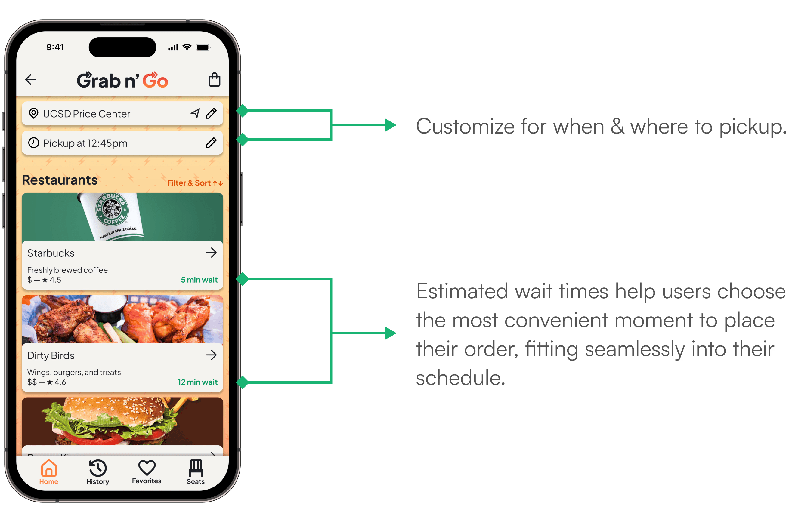
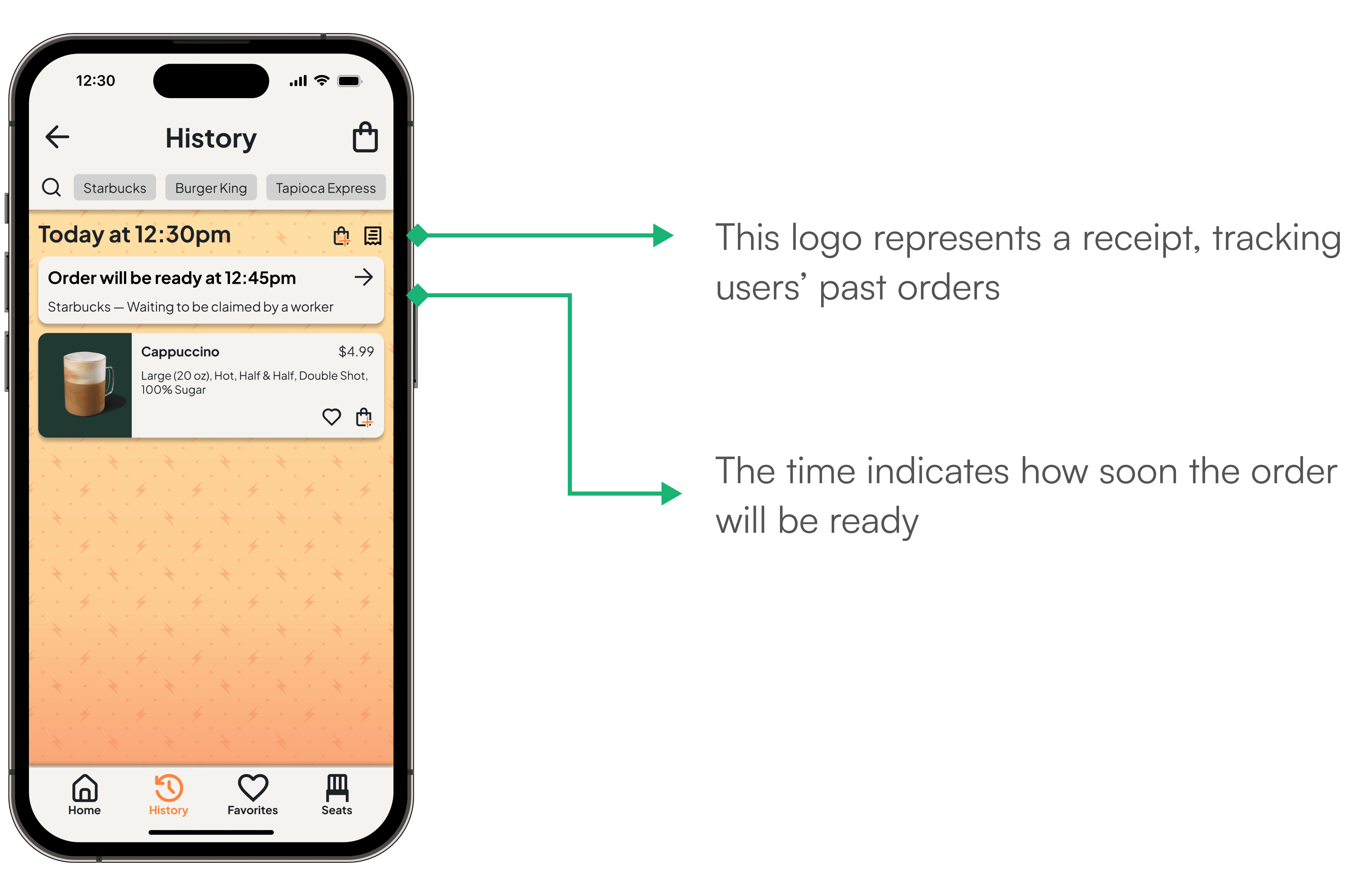
01. Support Effortless Ordering
Speed up food ordering with a simple tap, making the process effortless and convenient. This minimizes long lines and reduces order errors.


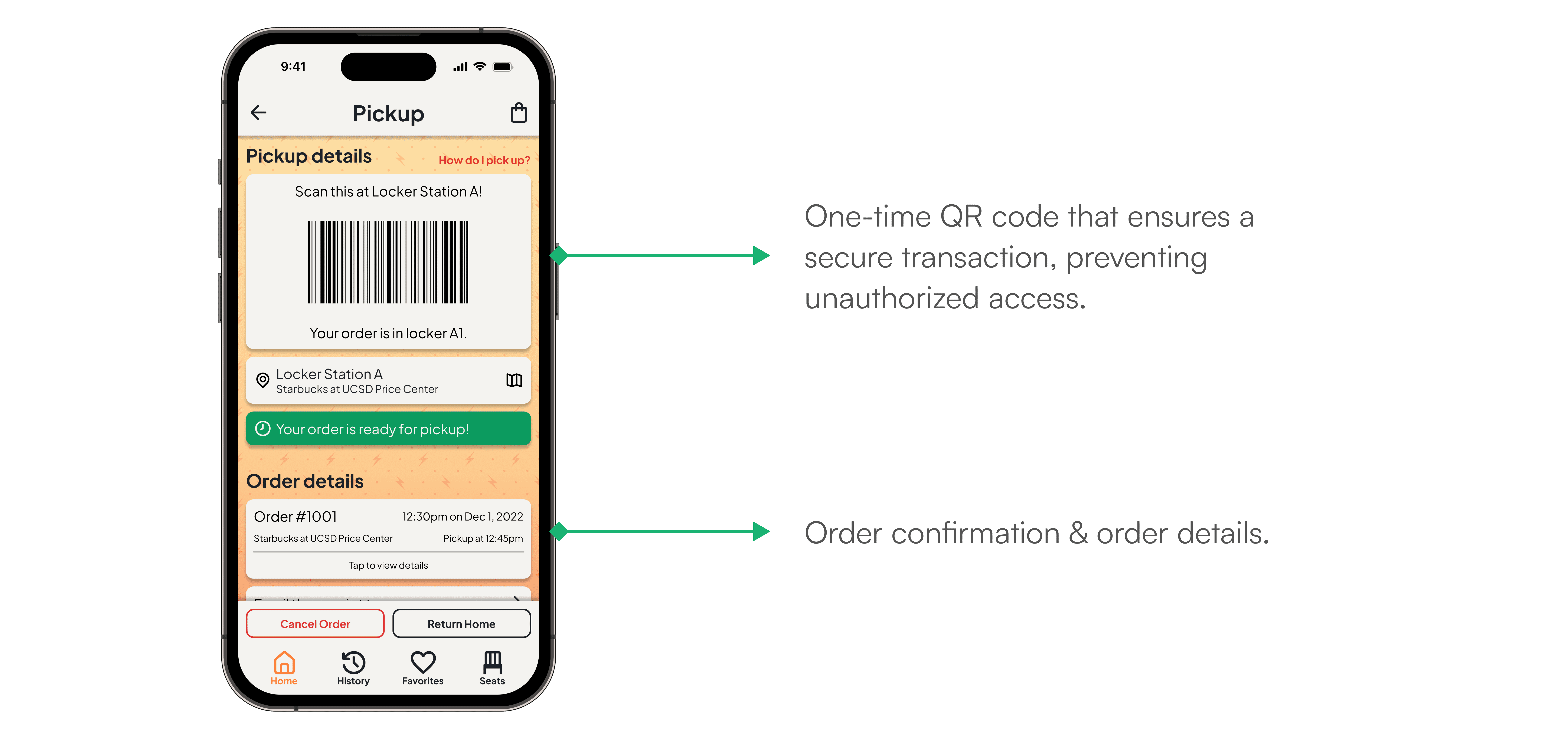
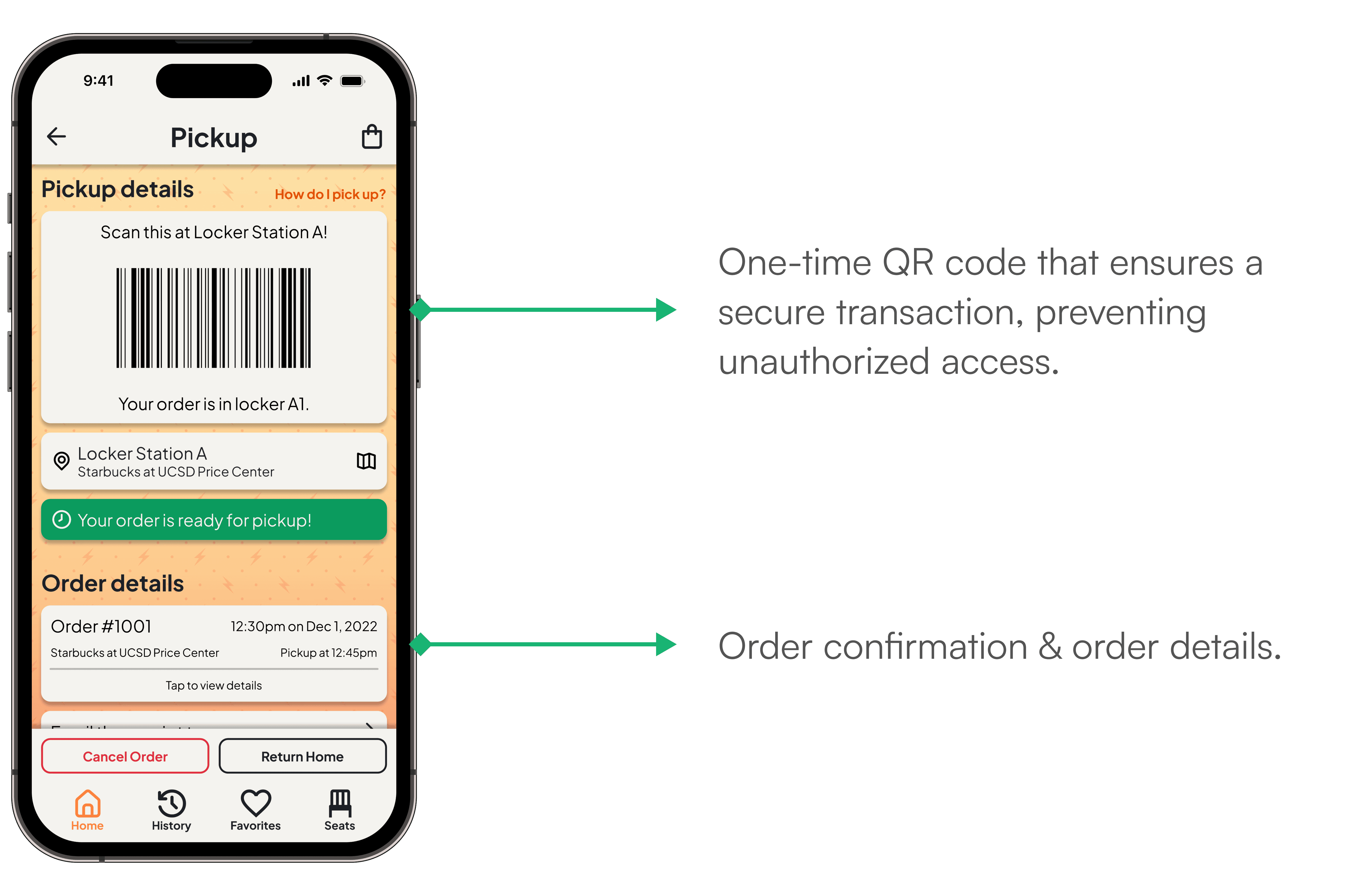
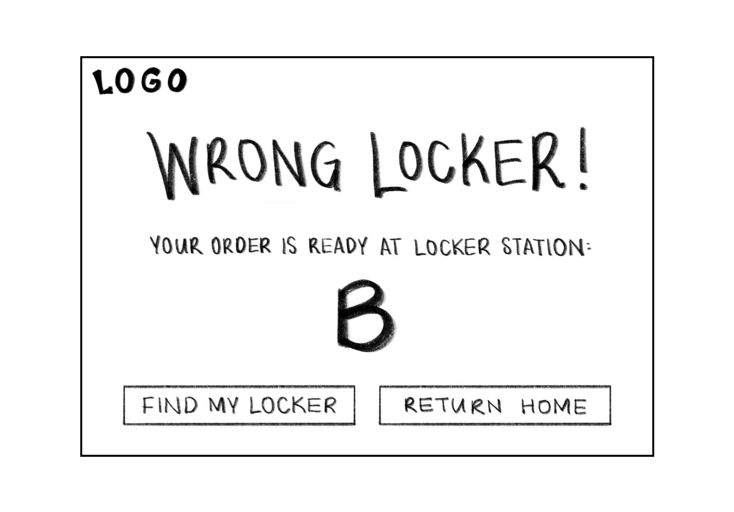
03. Ensure Secure, Contactless Pickups
Experience safer, more seamless pickups with one-time QR codes, addressing security concerns and reducing close-contact risks.


Wait a minute, how did we achieve this? Let’s rewind and go over the steps we took.
📚 RESEARCH + INSIGHTS | DIGITAL
Was this just a me problem?
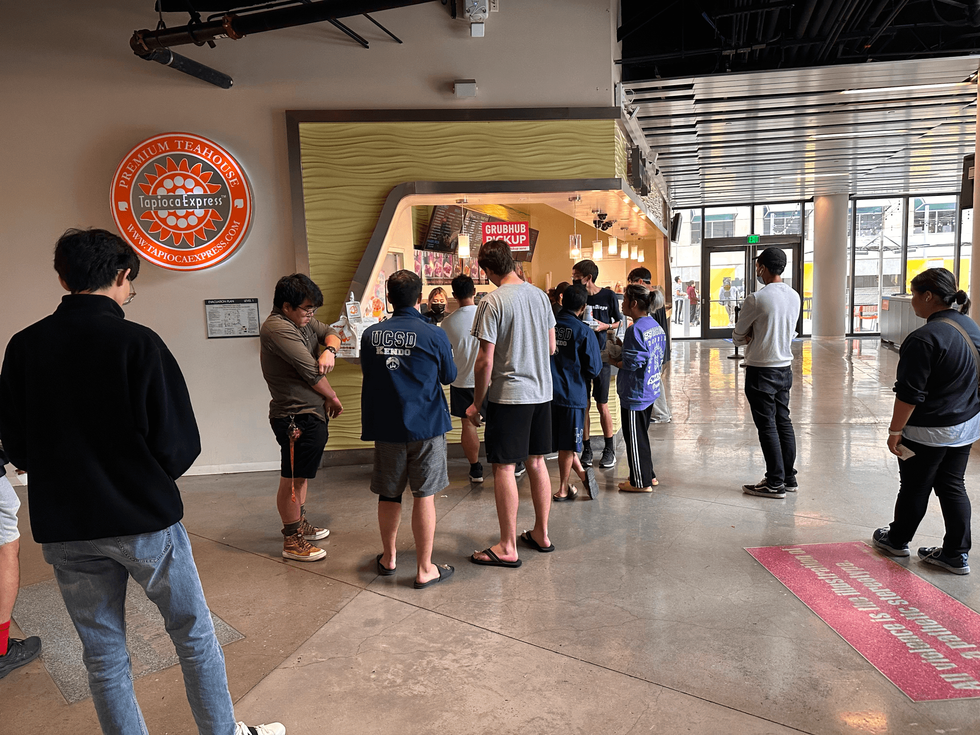
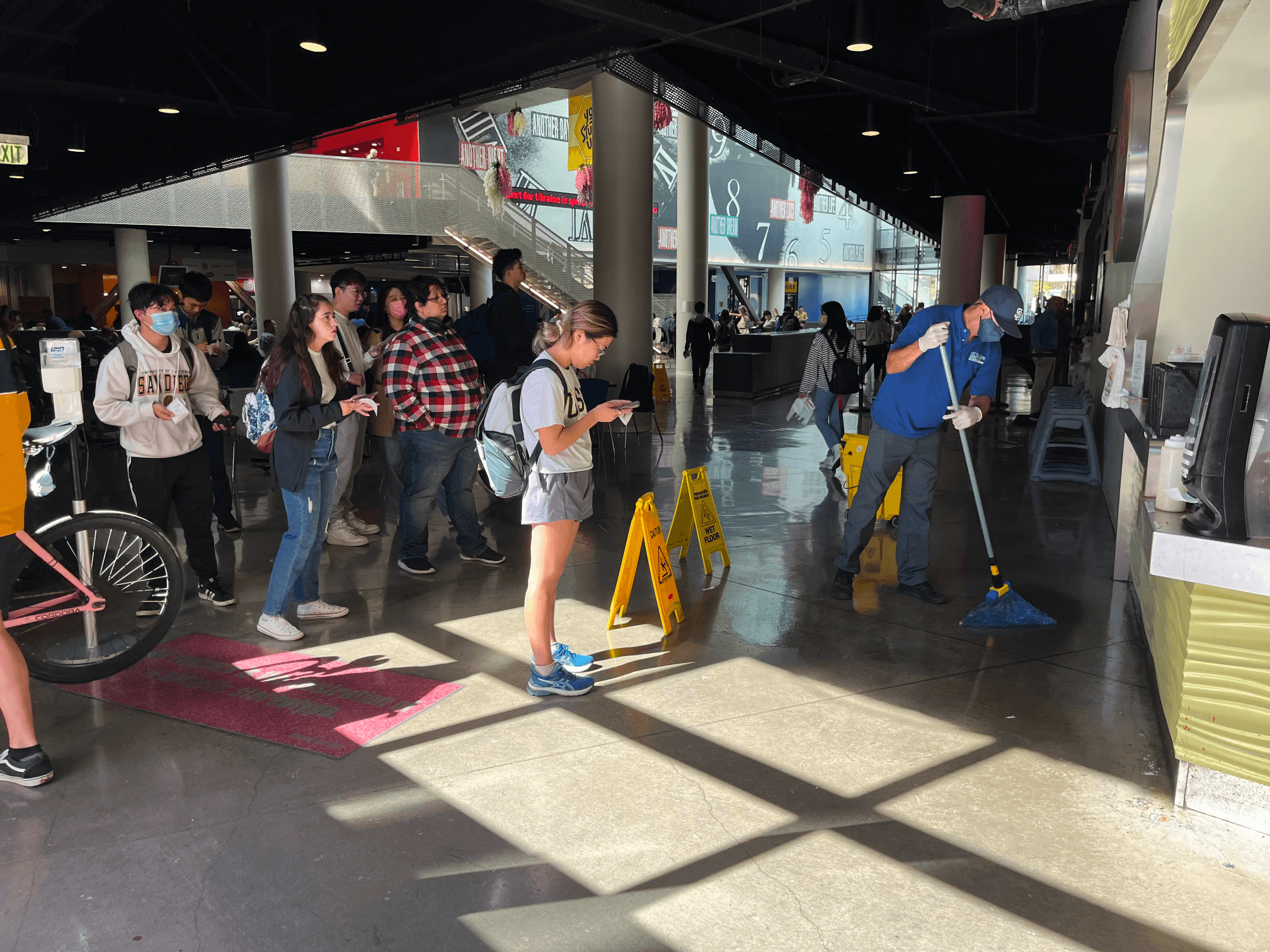
To validate the problem, I conducted research that uncovered users’ frustration with long queues, unclear pickup locations, peak-hour congestion, and limited seating.
Wanting firsthand insight, we headed to Price Center, the bustling food court at UC San Diego, to observe how people coped with the problems they faced.


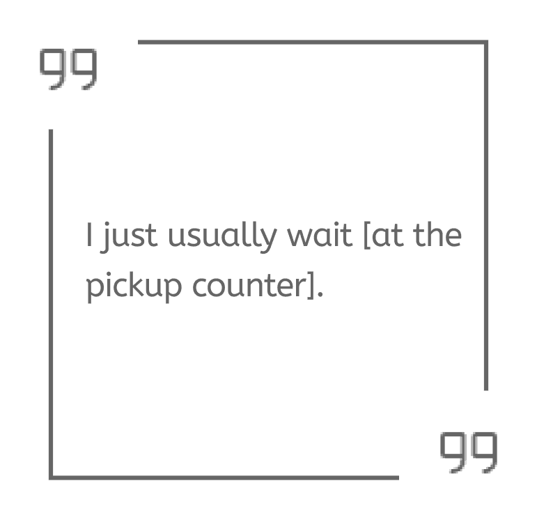
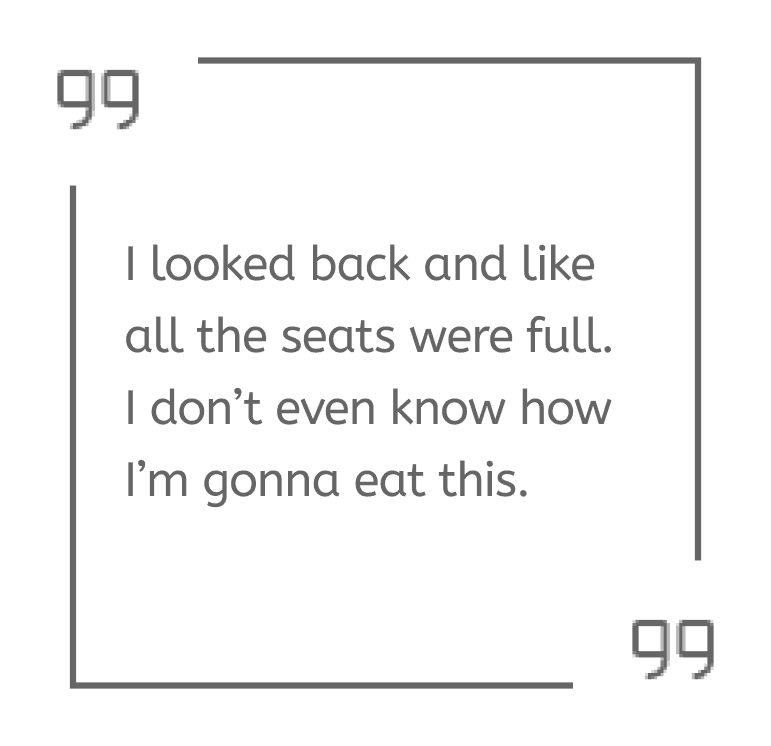
Giving a Voice to the Struggle
We interviewed 5 target audiences at the food court to gauge frustrations and gain deeper insights into the unmet needs.


Audio recordings from interiews!
We were pleased to find that the feedback we received aligned with the problem space we identified and highlighted the importance of addressing these issues to enhance the dining experience.
💡 OPPORTUNITIES
Identify Our Goals
Our high level goals were to:
Reduce friction at every touchpoint and optimize operational efficiency.
Empower diners with real-time wait time predictions.
Automate the ordering and pickup process through interactive locker system.
🔎 IDEATIONS & EXPLORATIONS | DIGITAL
Visualize User Flow
We outlined how users would interact with the app; this stage is all about deconstructing and optimizing the app architecture.
Drag to explore—User Flow in Figma
To kickstart the design work, we started with some sketches
We played with different layouts and sketched out both app and kiosk screens. At this point, we focused on exploring on how to best utilize the combination of digital app and physical kiosk. Here are some out of many:


📝 USER TESTING + ITERATION
De-risk the assumptions
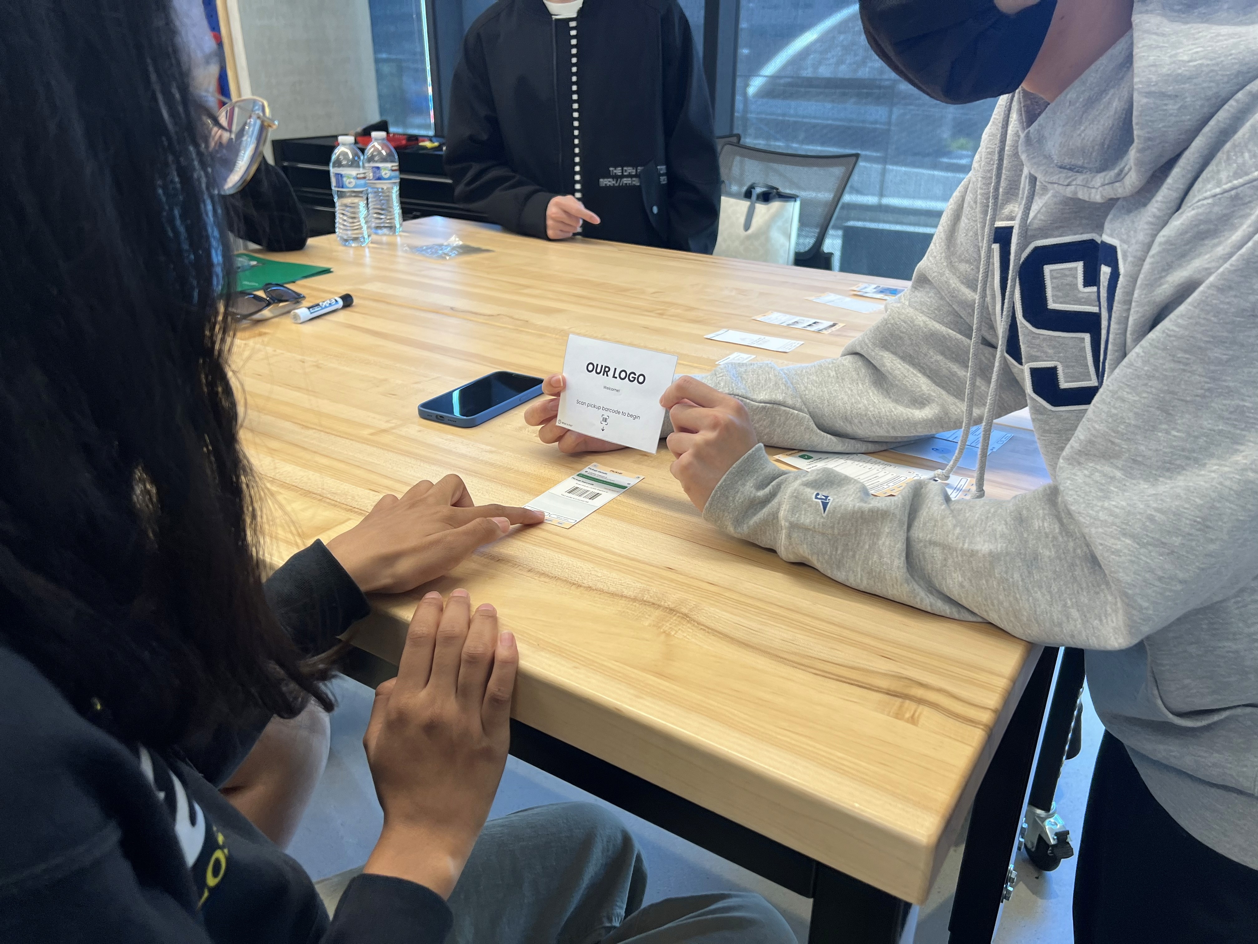
We feared that our prototypes would not align with user expectations, so we built paper prototypes and test them with target audiences to validate core concepts and layout comprehension. The feedback later helped refine the design.


Things we changed based on feedback
Based off the feedback we received from the first round of user testing, we made a few changes on our mid-fi prototype.


User Testing, AGAIN.
We conducted another round of user testing with BOTH digital and physical prototypes. No scripts, just real people. We observed, learned, and tweaked. This ensured that our designs are tailored to meet the user needs and provide them with a smooth experience.


More iterations
Based off the feedback we received from the second round of user testing, we made a few changes on our mid-fi prototype.

🎨 BRANDING GUIDELINE & MOODBOARDS
Branding Guidelines

Moodboard
We curated a moodboard for brand inspiration, centered around orange—a color known to evoke a sense of action and progress).

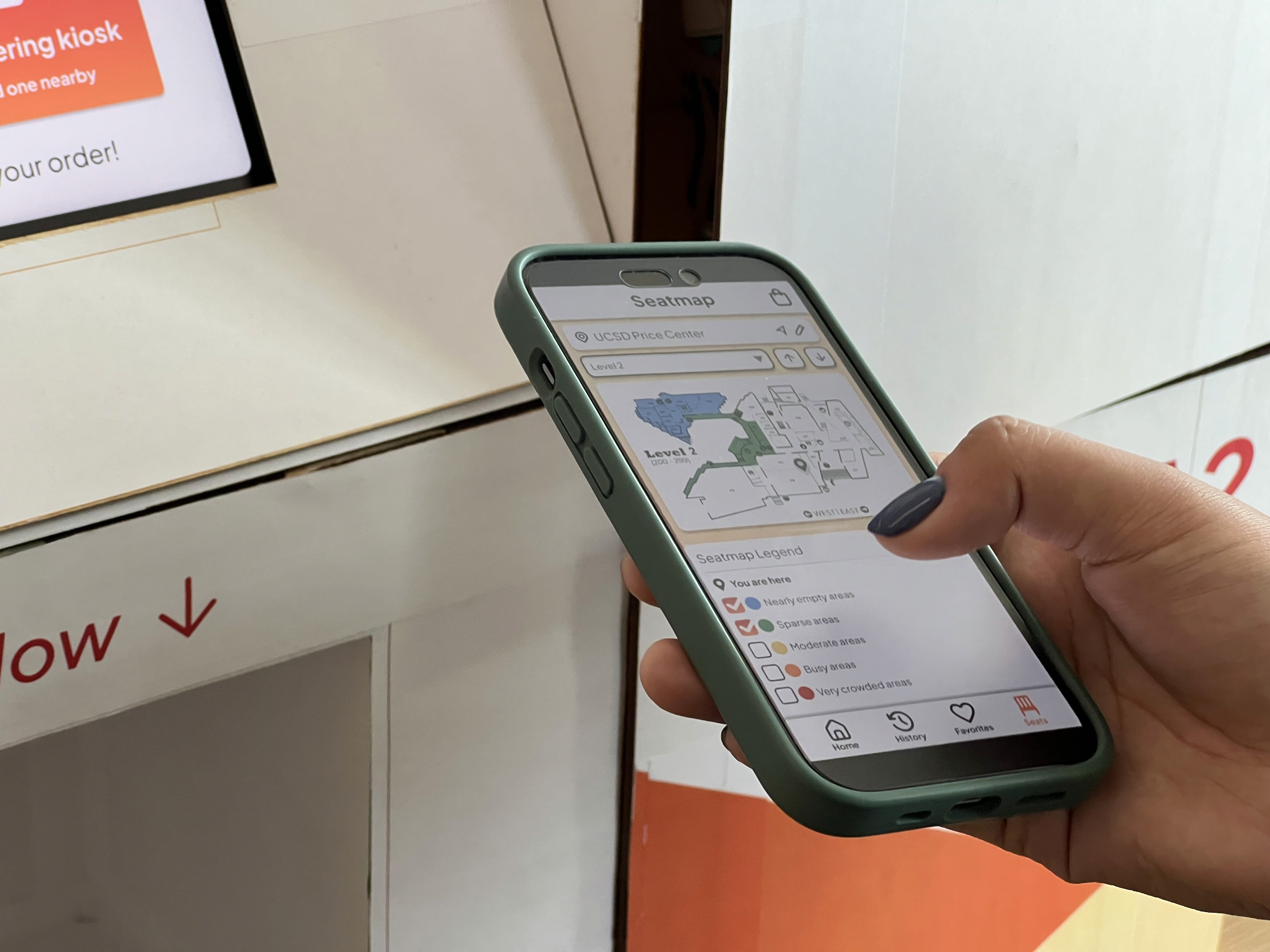
🌟 FINAL HIGH-FIDELITY PROTOTYPE | DIGITAL
The final look of hi-fi prototype


📚 RESEARCH & INSIGHTS | PHYSICAL
Online Research
Research showed that lockers with kiosk emerged as versatile tools, offering benefits for businesses and customers across industries. This informed our design approach, ensuring we created a solution that meets user needs effectively.
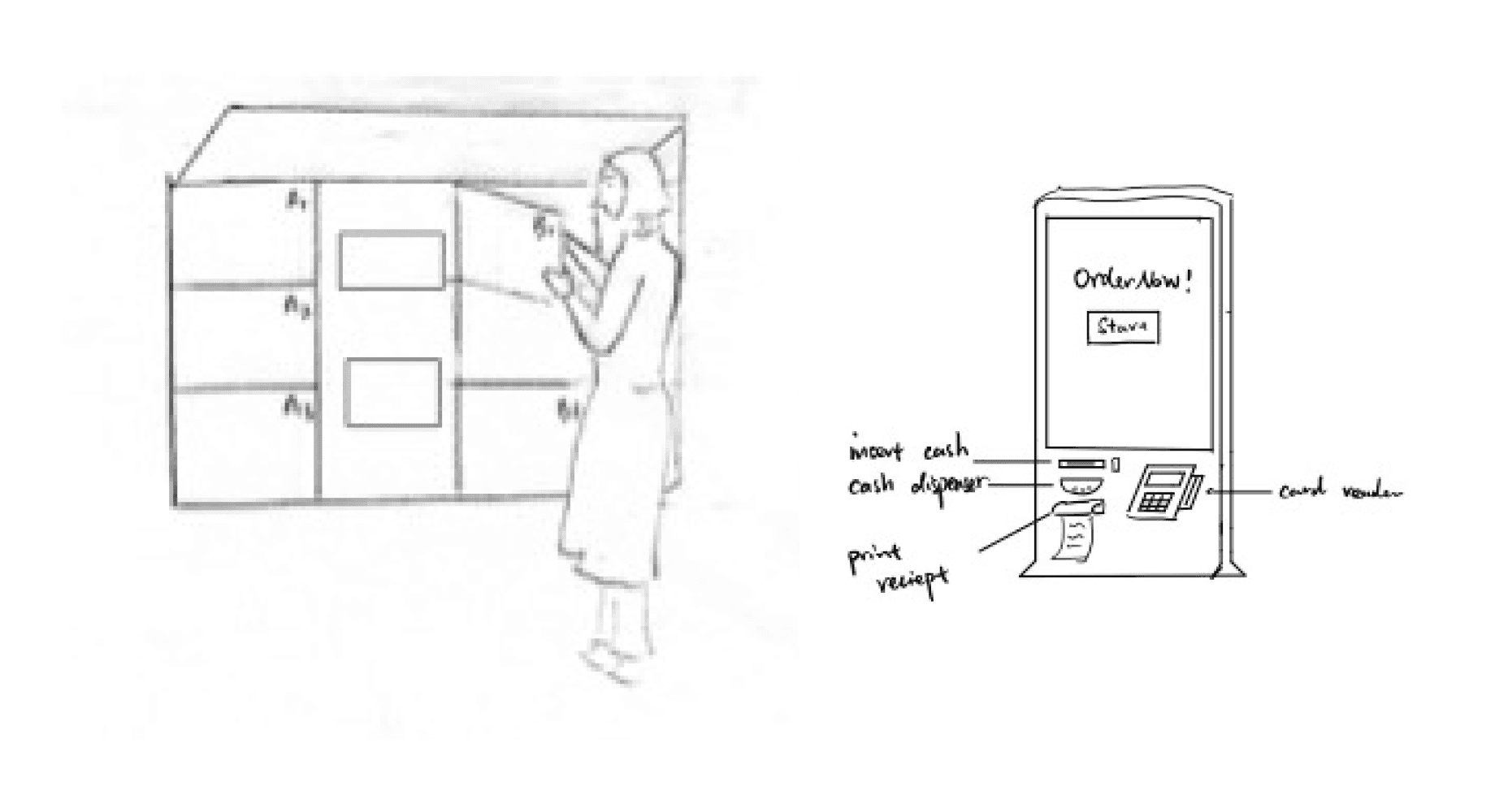
🔎 IDEATIONS & EXPLORATIONS | PHYSICAL
User Flow

Sketches of different types of lockers & kiosks


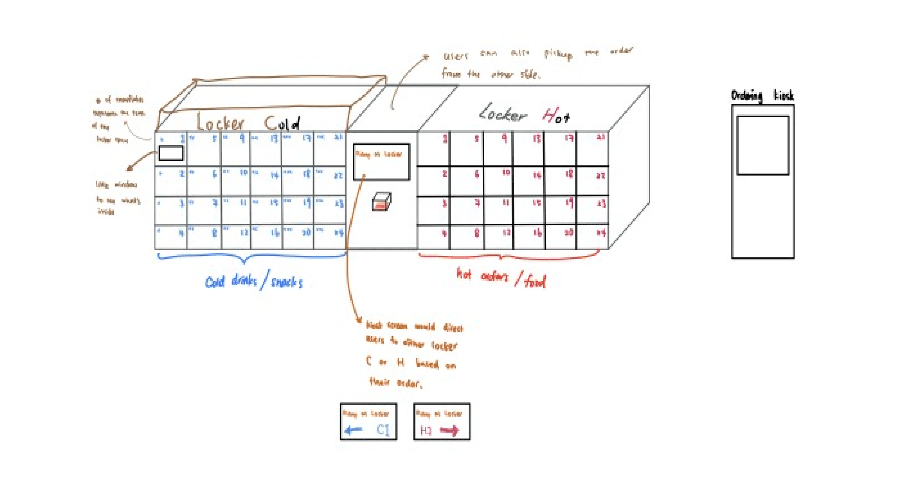


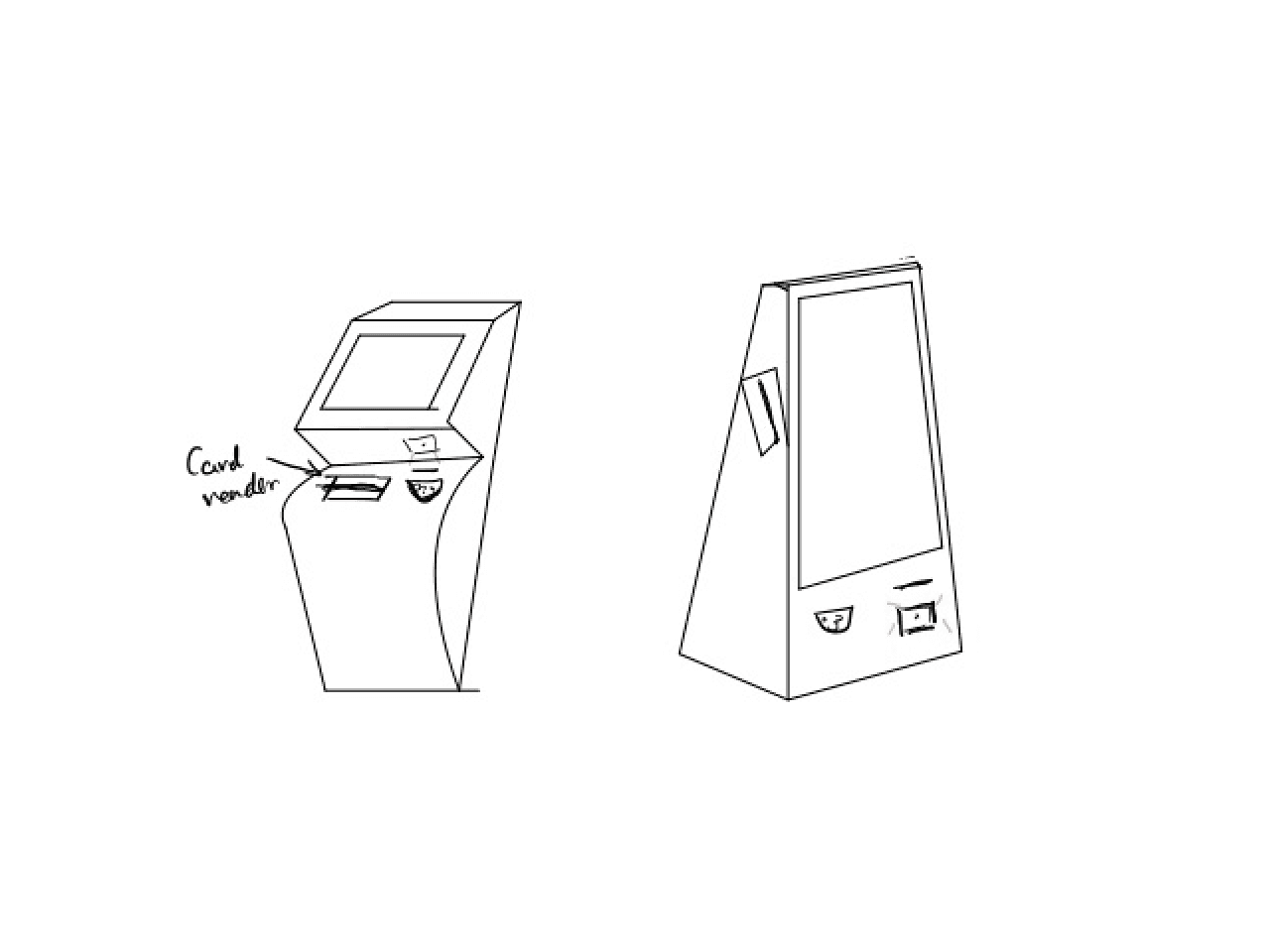
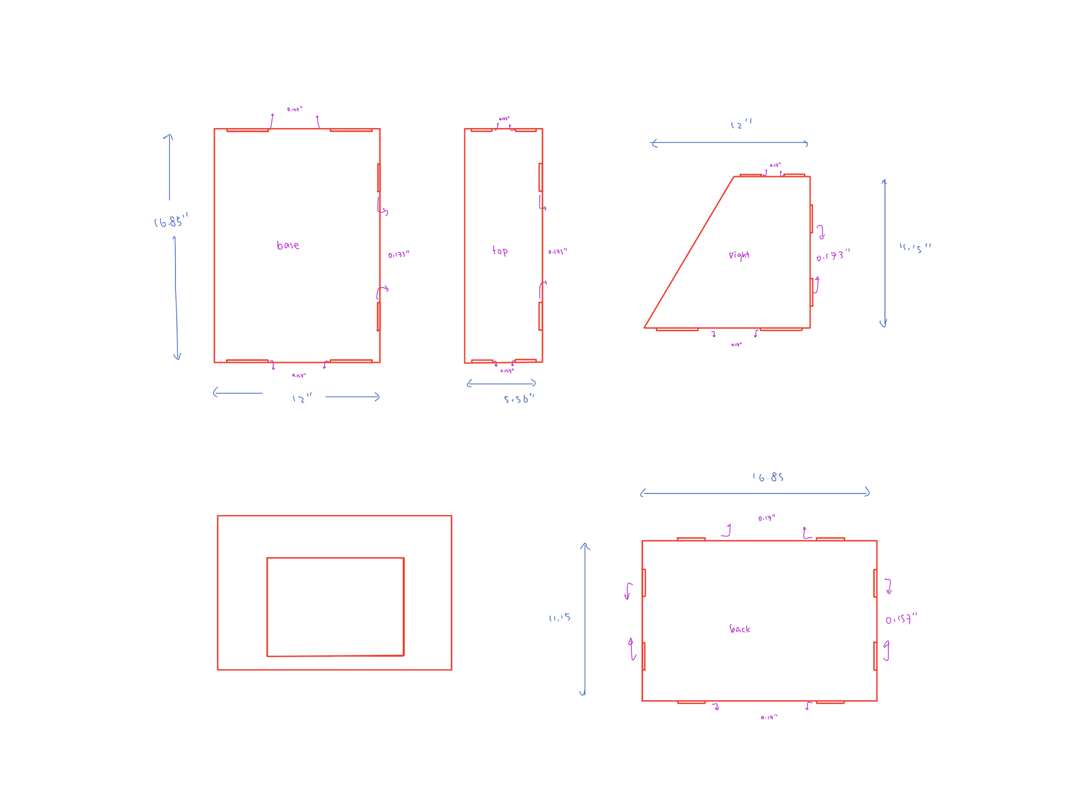
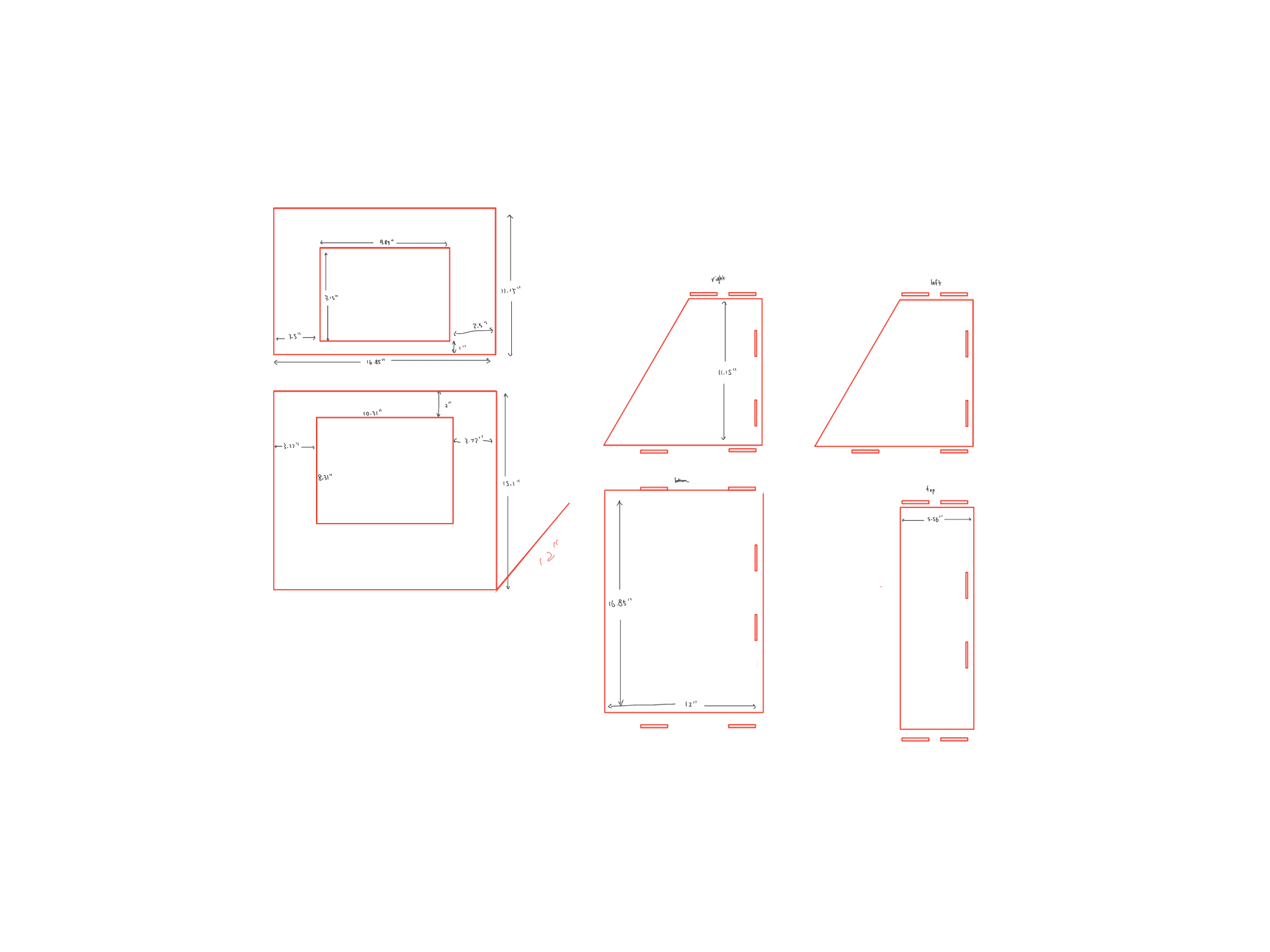
📐 STRUCTURAL DESIGN | PHYSICAL
Blueprints of the Locker & Kiosk
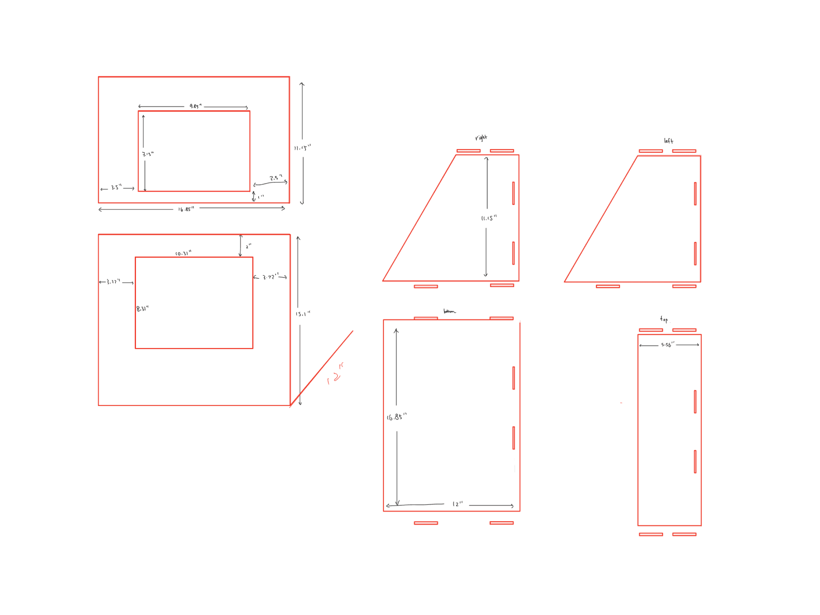


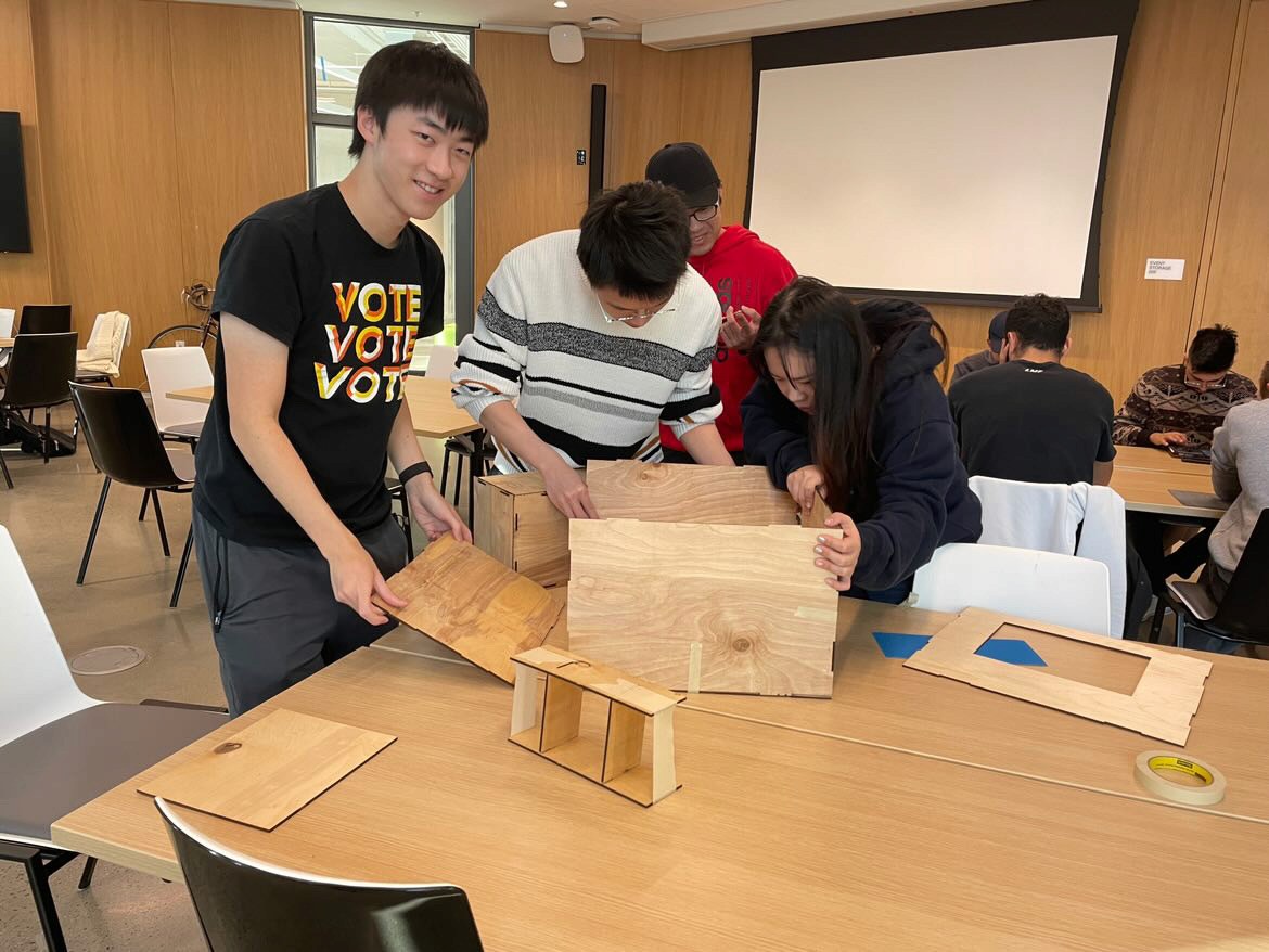
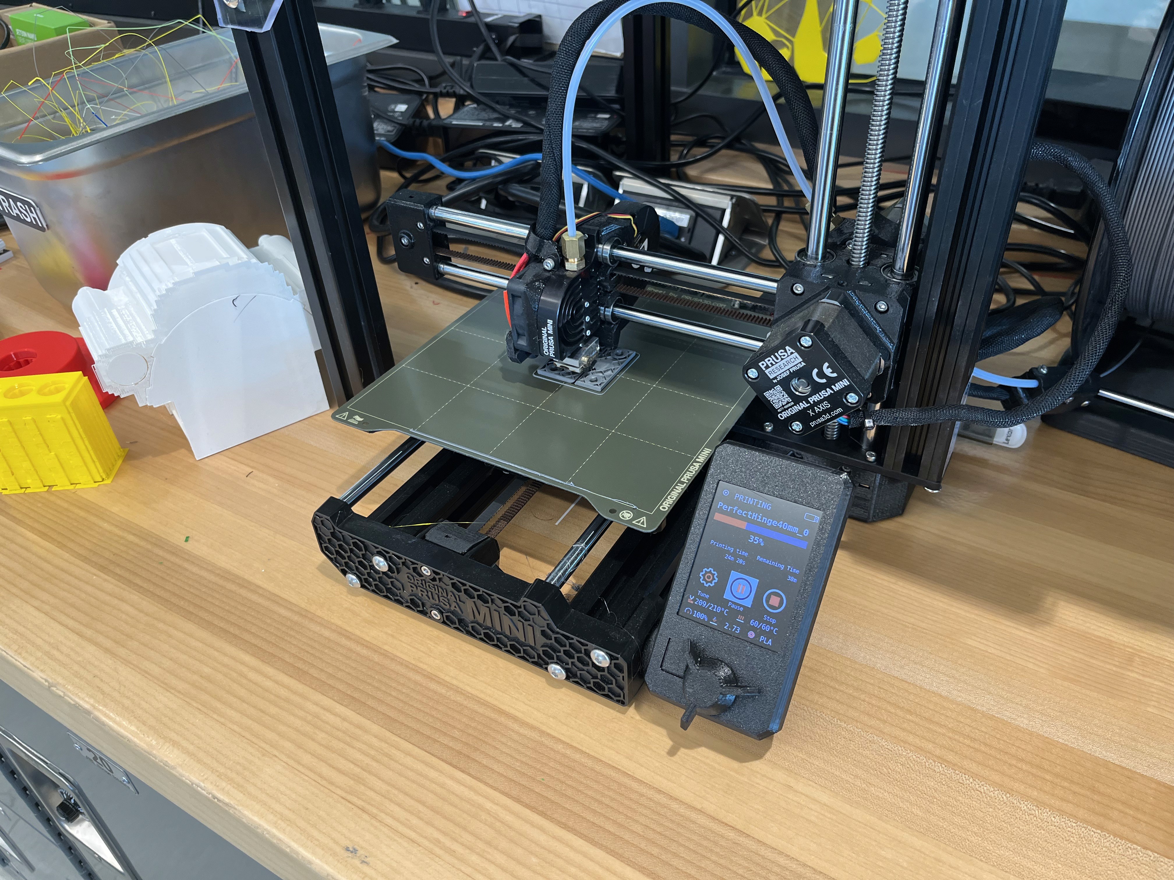
Assembly Process
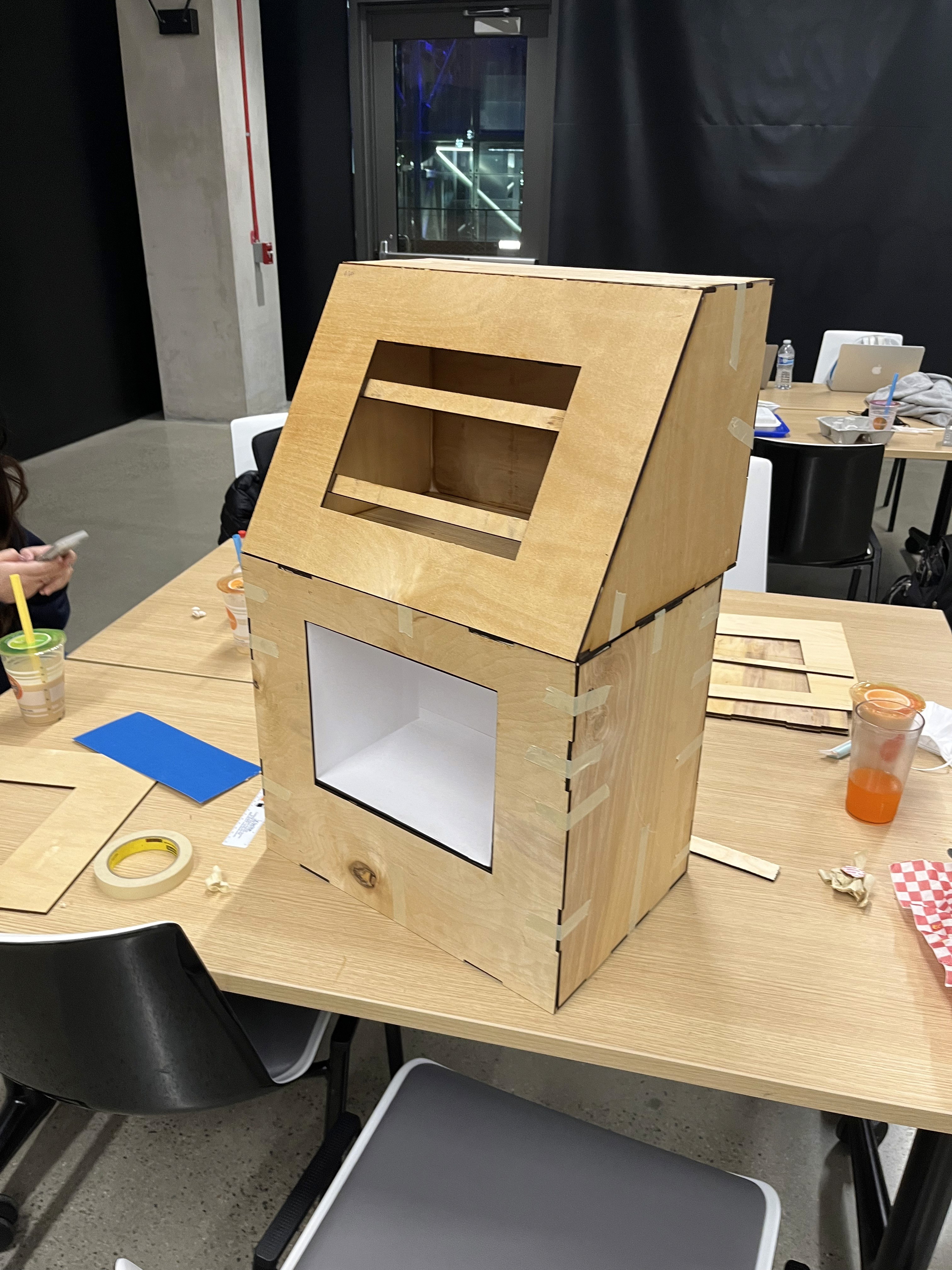
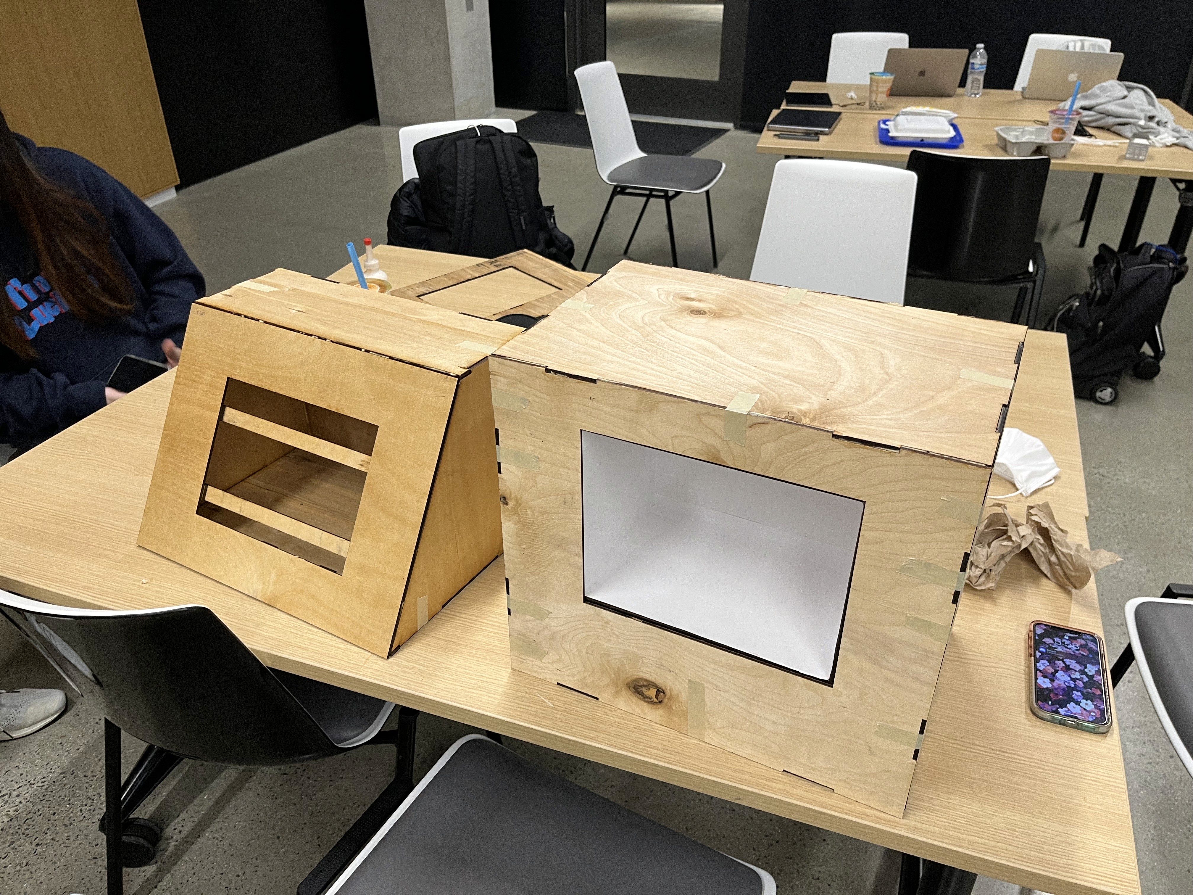
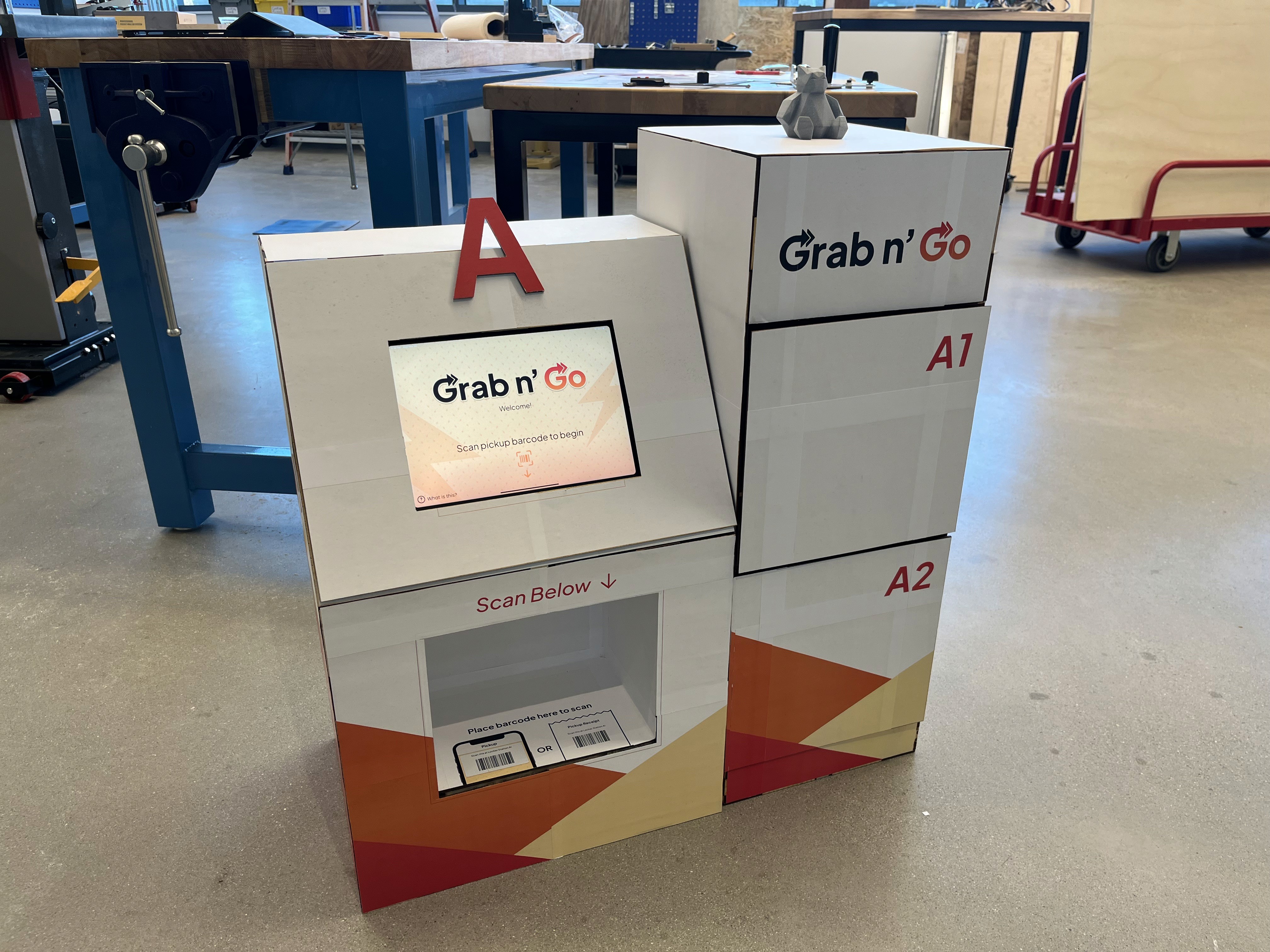
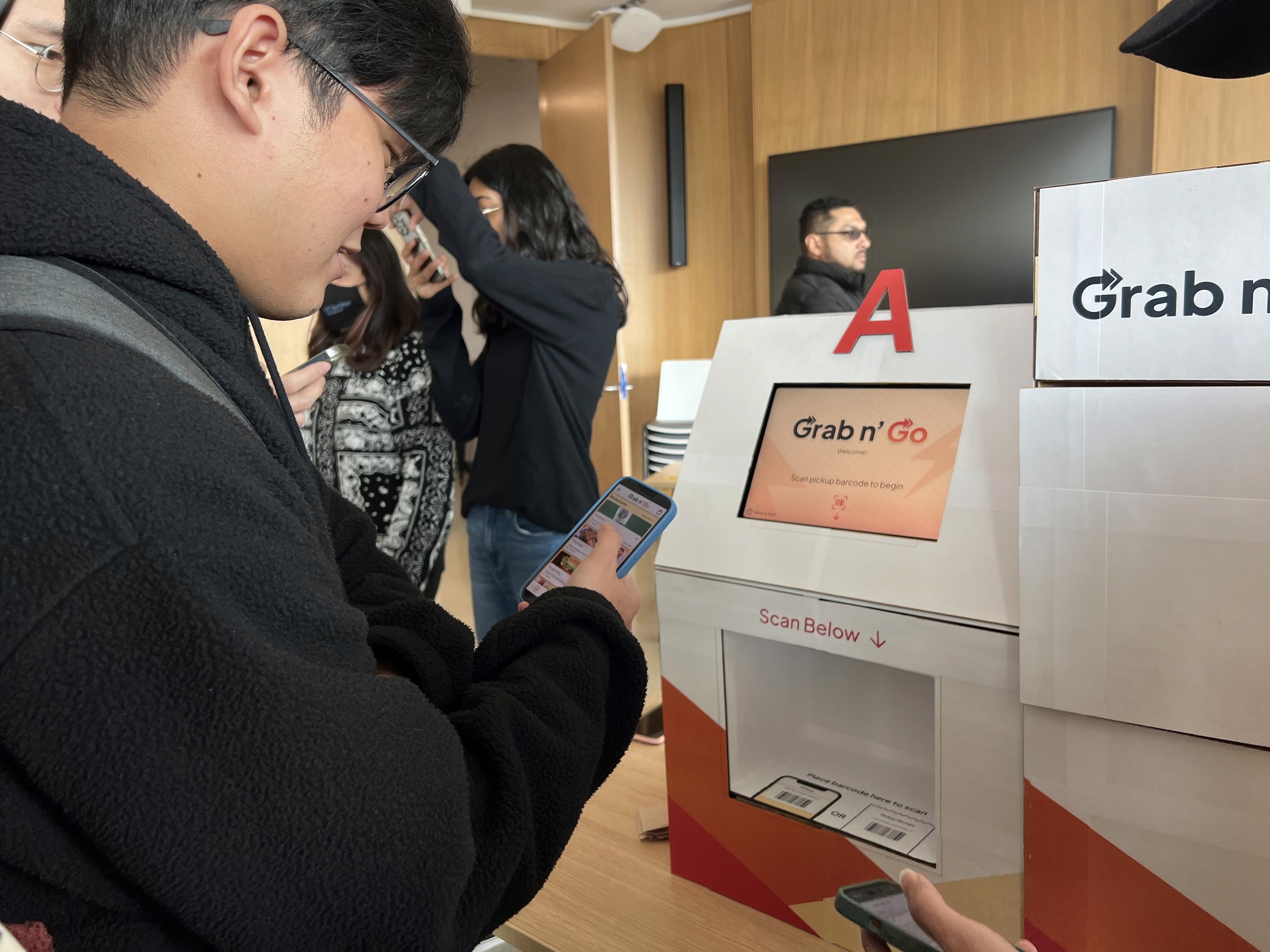
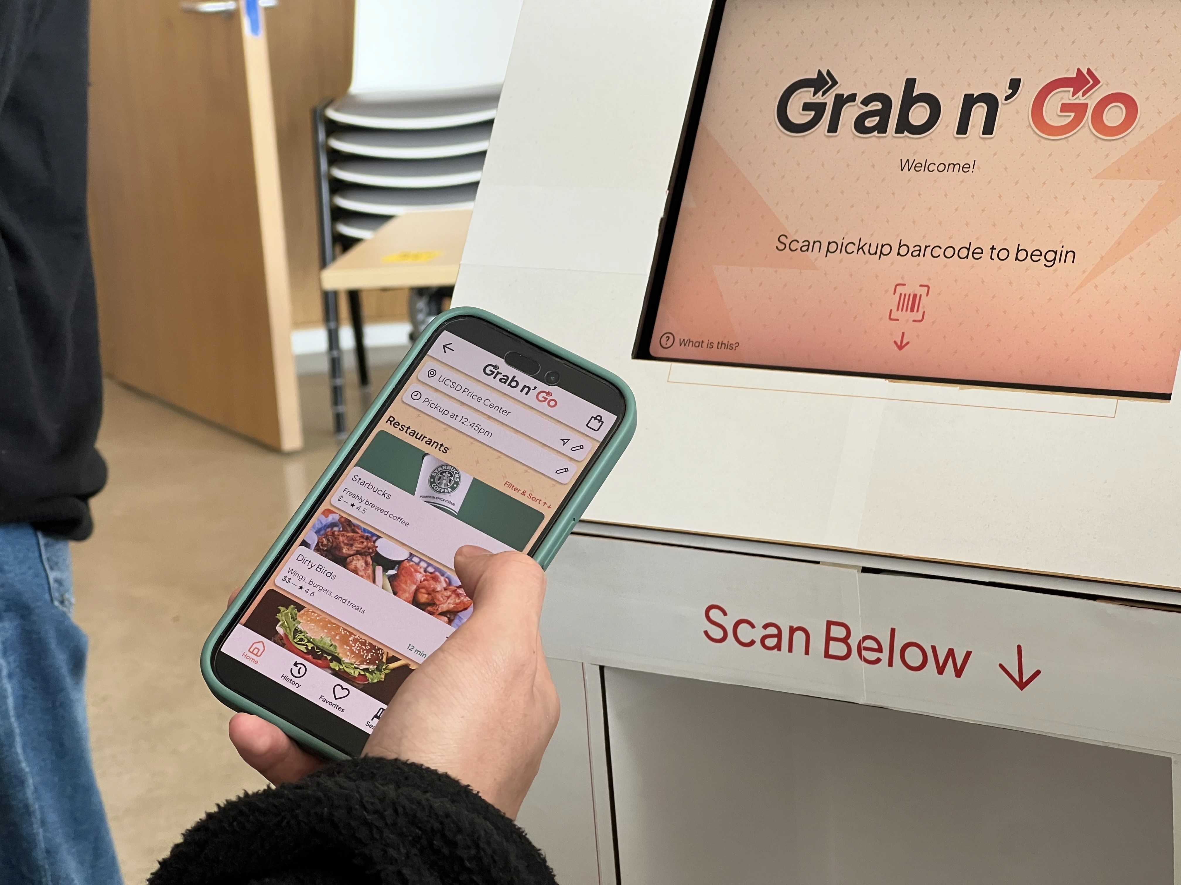
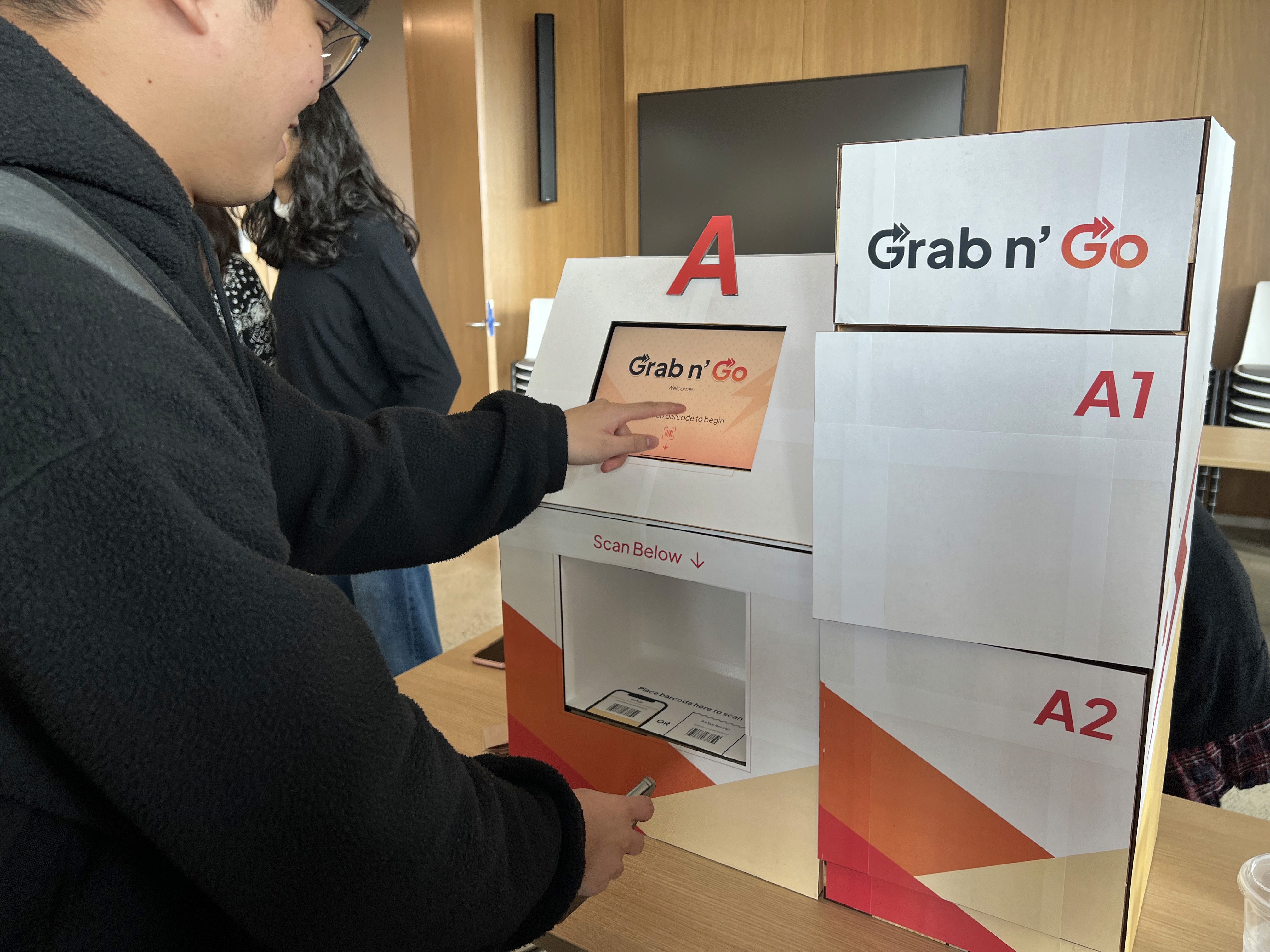
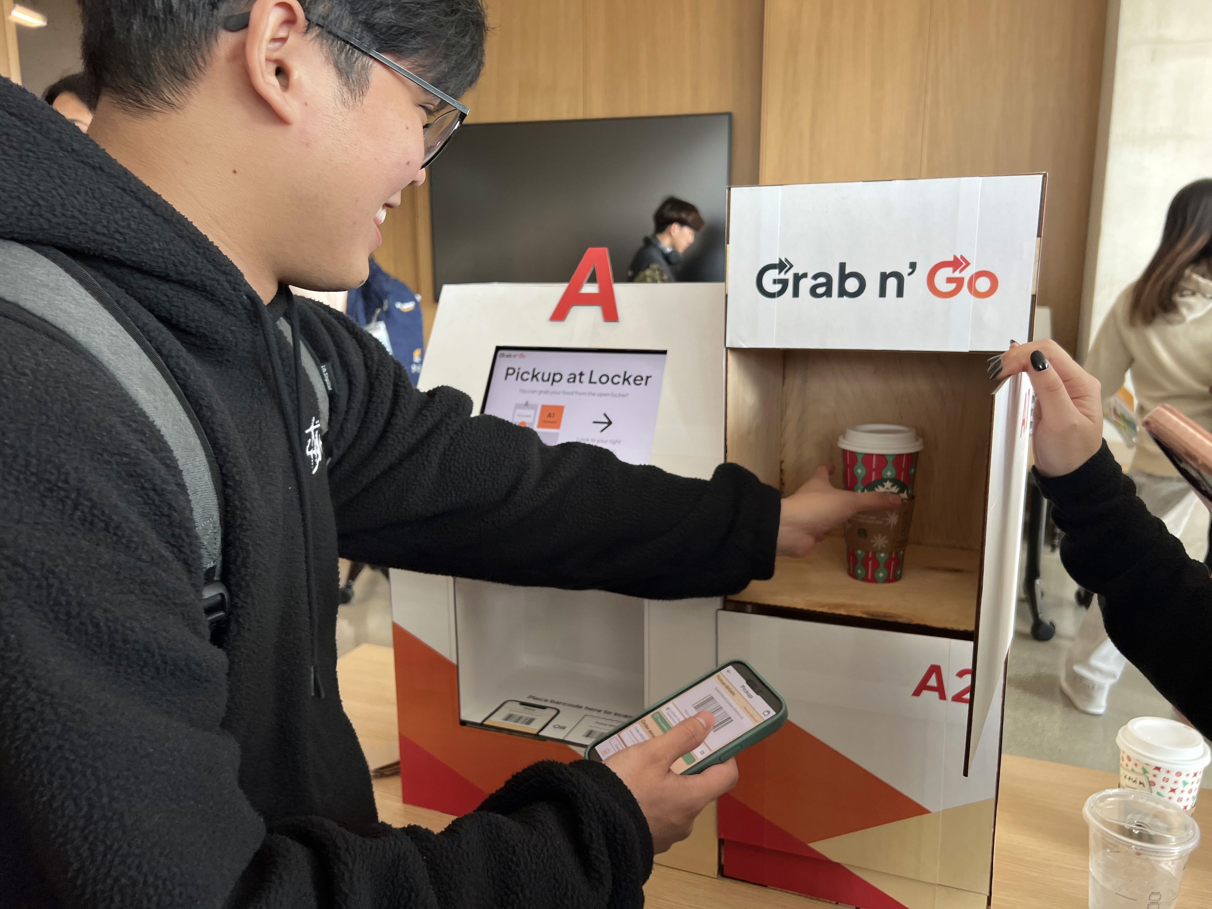
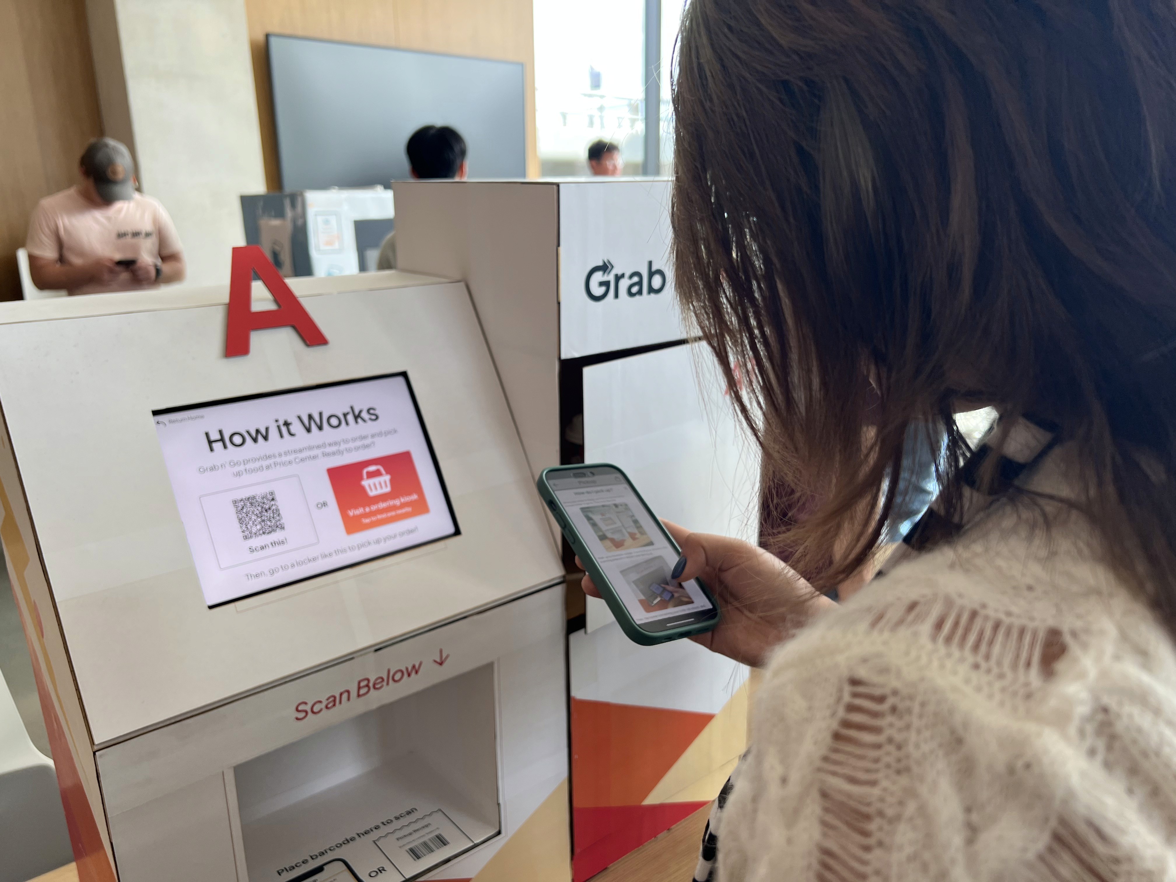
🌟 FINAL PROTOTYPE | PHYSICAL
Take a look at the system we implemented :)
Slide the handle to the left for annotations!
💬 REFLECTION
What I've learned?
In this project, I was thrilled to explore new horizons and challenge myself with many novel experience including using with Miro, Dovetail, Inkscape, 3D printer, and laser cutter. I've never worked with these applications or tools before, but I'm proud to say that I successfully gained a couple more skills.
I also learned the importance of stakeholder input. Stakeholders came from diverse backgrounds and perspectives, often needing and wanting different features than what we, as designers, envisioned. By involving them in the design process, I was able to understand their needs, preferences, and expectations better, allowing me to create a solution that effectively met their expectations and brought satisfaction.
Something that I could've done differently is make a business model canvas and conduct more interviews at other food courts to ensure that these issues are a common issues in general.
A major challenge for my team and I was the lack of resources and skills to implement the locker and scanning mechanisms for this project. Hence, our next step would be to enhance our project, obtain more materials and expertise, and test those mechanisms to assess the overall system experience.
Furthermore, we would continue to work on the project and create a business model canvas to show its feasibility and value proposition. I believe this project is very promising and worth exploring more.